—
3Form Navigation
Clarify the information architecture, refresh the look & feel
Company: 3form
Timeframe: 2015
Role: Freelance UX Consultant, Product Design, Visual Design
Overview
The 3form website is very complex and had grown organically for several years. The site’s navigation and information architecture had thus become outdated and bloated. Ahead of the redesign, I led a research project to compare management objectives with customer goals and mental models. The results were then analyzed and a proposed restructuring was made back to company stakeholders.
nailing the information architecture
I organized several rounds of card sorting to understand the viewpoints of the different users of the website. I first ran the test with the internal marketing team to help them understand the technique. We then took the exercise to a group of ten department managers including the CEO. The takeaways from this round helped inform the site IA from the side of business priorities.
Lastly, we did several additional card sorting rounds with our customer consultant team whose role it is to work with customers everyday on the phone (often helping customers navigate the confusing existing website). Their perspective was valuable to understand the voice of our end users. The results were compiled, analyzed, and a new proposed site map was generated.
wireframes & visual design
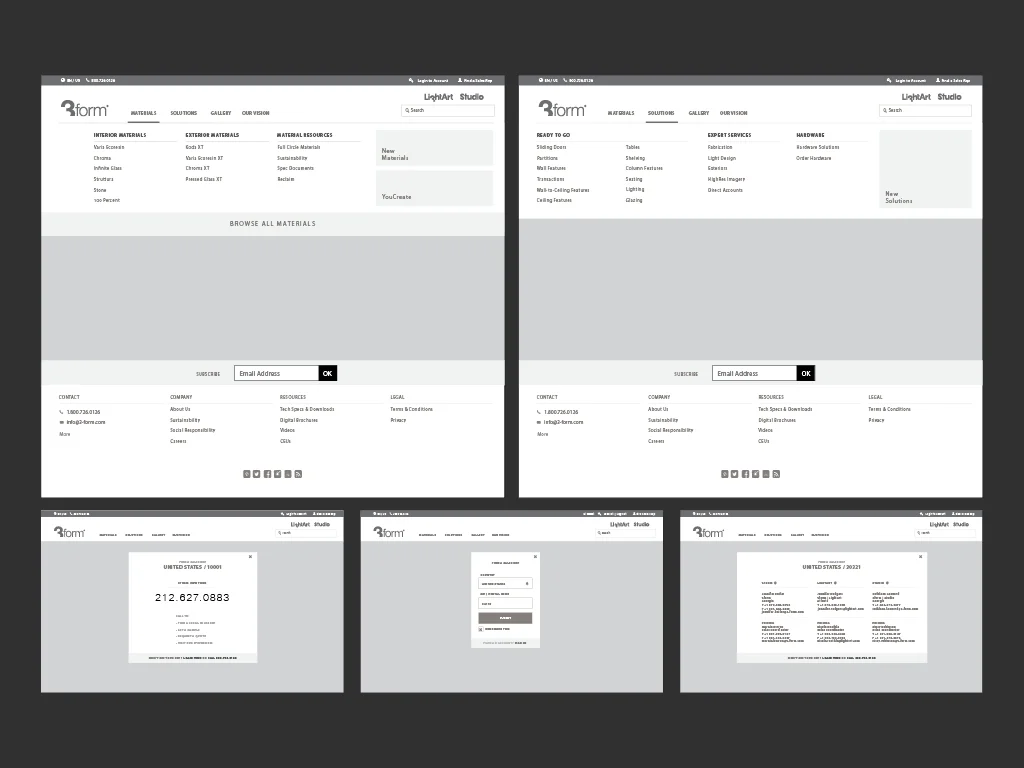
After the proposed site organization structure was approved, I created a set of medium-fidelity wireframes to test the IA in context of a navigation. I also started to explore typography and layout. The final designs stuck with the minimal aesthetic the brand was known for. The result was a cleaner, clearer design that clarified the relationship between 3form and its sub-brands as well as made it easier for prospects to quickly find the contact info for their local sales representative.


